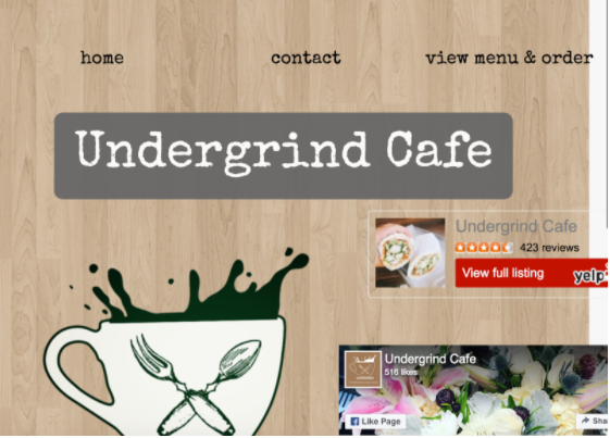
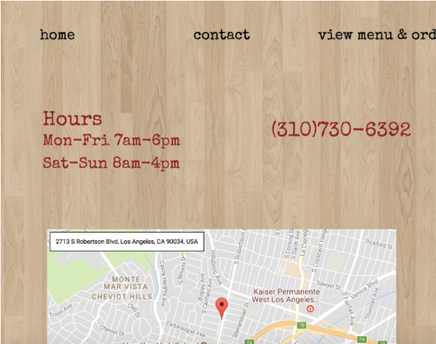
The website includes contact info including the hours, phone number and location of the cafe. There is a link to the cafe’s Facebook and Yelp pages on the homepage. There is also a page for the menu and customers can order directly from the site. The website is responsive and works when accessed from a mobile phone.
The website lacks an overall structure and the text and images feel arbitrarily placed and unbalanced. The wood background doesn’t stretch all the way down or across the page. The graphic and text elements do not speak to each other, and the typewriter font looks tacky. The website only has three pages and has no pictures. The organization of the menu is confusing and there is no icon or title in the tab bar. The homepage includes the words “Undergrind Cafe” twice (once in the header and again in the logo). In addition, the logo looks very “clip art-y” and could use some work. The lack of a typographic hierarchy makes it hard for the user to navigate the website. The overall design feels aesthetically outdated and the website lacks relevant information.
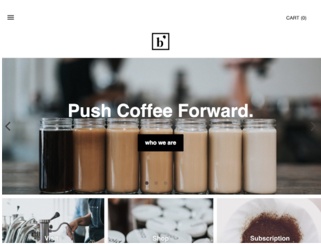
The site is well structured and works within a grid system. The logo is simple, elegant and captures the “feel” of the cafe. All of the relevant information is included in the menu including a “who we are” about page. The rotating pictures are eye-catching. The user can purchase products and take classes directly from the site. In addition, users can also sign up for the newsletter at the bottom of every page and use the search bar to find specific posts. The overall design is very modern, clean, and the website is easy to navigate.
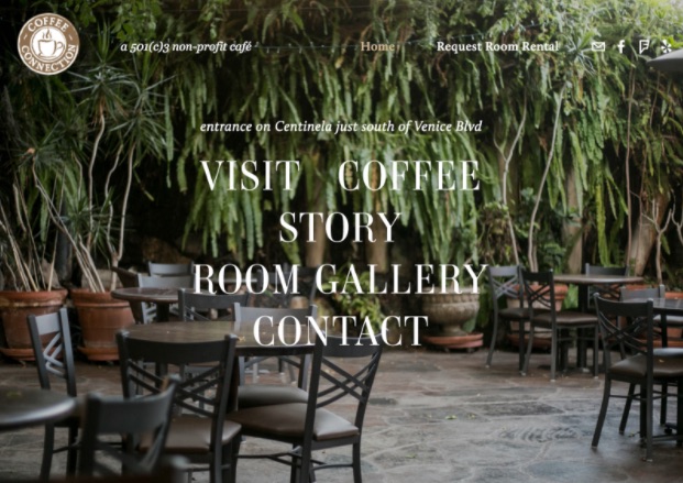
The website has a very navigable scroll effect which displays a wealth of content on the homepage so the user doesn’t have to click through each page to find what they are looking for. There are links to the cafe’s social media pages at the top of every page. There are a lot of high res well-lit photos on the site. The background images change when the user hovers over different links on the homepage. The site menu is available at the bottom of each page. The site is responsive and looks good when accessed from a mobile phone.
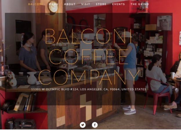
The homepage includes the address and links the the restaurant's social media pages. The color scheme works on the homepage and stays consistent throughout the entire site. There are many pages within the website that include relevant information like “menu” and “events.” The background photograph makes the text hard to read. The body font doesn’t work with the rest of the site’s aesthetic. The website is responsive and works when accessed from a mobile phone.
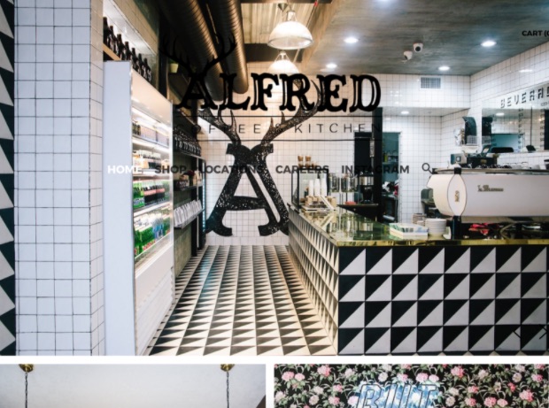
The “call to action” on the homepage is bold and fun. However, the images make the text very hard to read. There is a link to the cafe’s Instagram at the top of the page but the website does not include the cafe’s menu. The homepage seems to have a lot of content on it but it is not very organized. The logo is interesting and eye-catching, and the overall design is quirky and playful.
“Undergrind is where I would want to go for coffee; artsy and edgy.” –Rachel Sazon, owner
The current website does not say “artsy and edgy” to me. The redesign needs to reflect Rachel’s vision. The goal for the redesign is to make the Undergrind Cafe website stand out against all of the other cafes in the area. The website needs to be stylish, tasteful and balanced. The website must contain all of the relevant information. The logo needs to be redesigned, and the website’s overall aesthetic needs an update. Some questions that must be answered in order to complete this project are what is the cafe’s general aesthetic? Who are the patrons of the Undergrind Cafe? Are there any photos that can be used? What makes the Undergrind unique? Why choose the Undergrind Cafe? The tasks for completion include drafting a new logo, coming up with a way to organize the information on the site, establishing a cohesive aesthetic, drafting a moodboard and mockups for the redesign. Target audience: coffee lovers of all ages who live in the neighborhood or are just passing through. The redesign must be completed by the end of the semester.