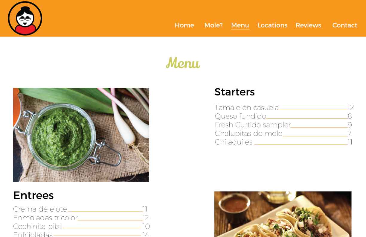
Menu page: Desktop aspect ratio
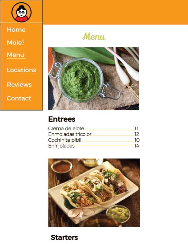
Menu page: Phone aspect ratio
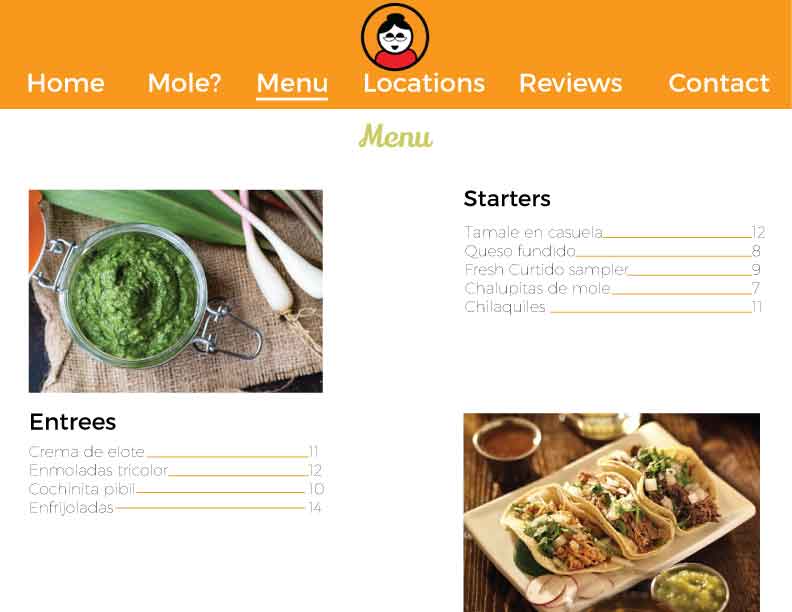
Menu page: Tablet aspect ratio
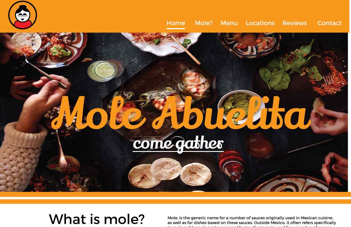
Mole? page: Desktop aspect ratio
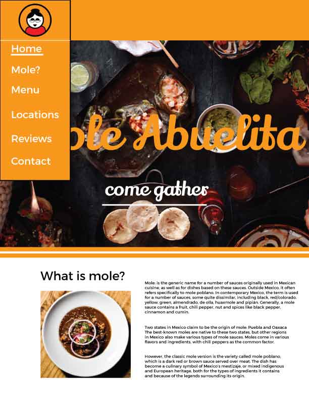
Mole? page: Phone aspect ratio
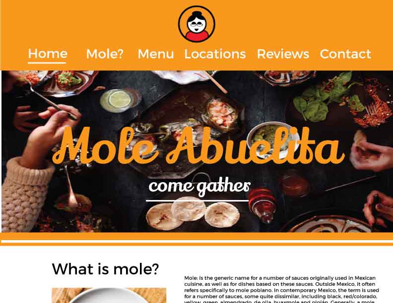
Mole? page: Tablet aspect ratio
Items working: 1.Image placement, 2. orange color is strong 3. Imagery is strong 4. logo is great 5. menu page feels balanced 6. color pallete looks great 7. Great typeface choices 8. Mole? is funny as a Nav element 9. Type sizes are great 10. Negative space is strong.
Needs work: 1. Text for menu is a little hard to see, consider bold. 2. Try a Hamburger menu 3. Feels a little empty 4. Logo placement could be a little more cohesive 5. Needs more contrast 6. change menu color 7. Orange header is a little heavy 8. Add name to logo somehow 9. spaces between nav links need to be even. 10. White background on logo to affect contrast.