This is the closest Asian noodle place I often visit. It is located inside of the Culver City Mall. This restaurant has a very small menu and everything on the menu has an affordable price. I really like to order their desserts after finishing my meal there. After researching about this restaurant, I found out that Azabu Sabo is from Tokyo, Japan and starts as a dessert shop and teahouse in 1979 by Mr. Gyo Kimura. Many years after, Azabu Sabo grows to be a full-menu restaurant and has outlets all over the world. It is famous for their soba noodle and green tea ice cream. There are three Azabu Sabo opened in the USA and all of them are located in southern California.
Pros:
Cons:
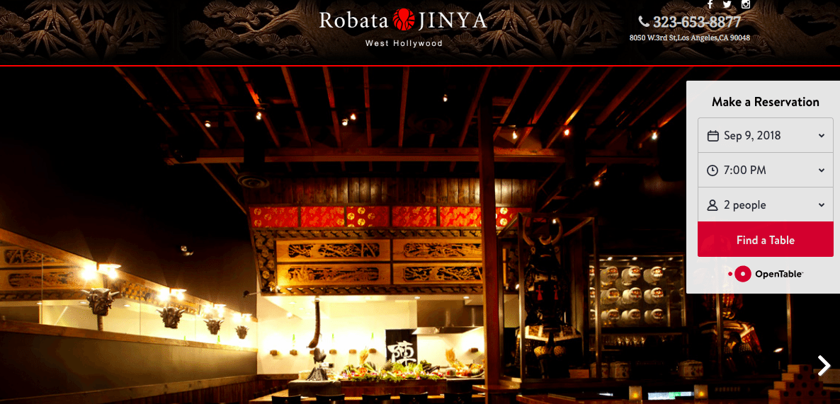
The homepage of Robata Jinya website clearly lists the contact information, such as phone number, the restaurant’s address, and social media. A pop-up sidebar contains a reservation form which is very functional and considerate to customers who just want to make a reservation with any phone calls. The website doesn’t have a navigation bar to subpages instead users can obtain all essential information by scrolling down the page. I really like this unique design considering it is a website for a restaurant which customers want to capture most of the important information in one spot.
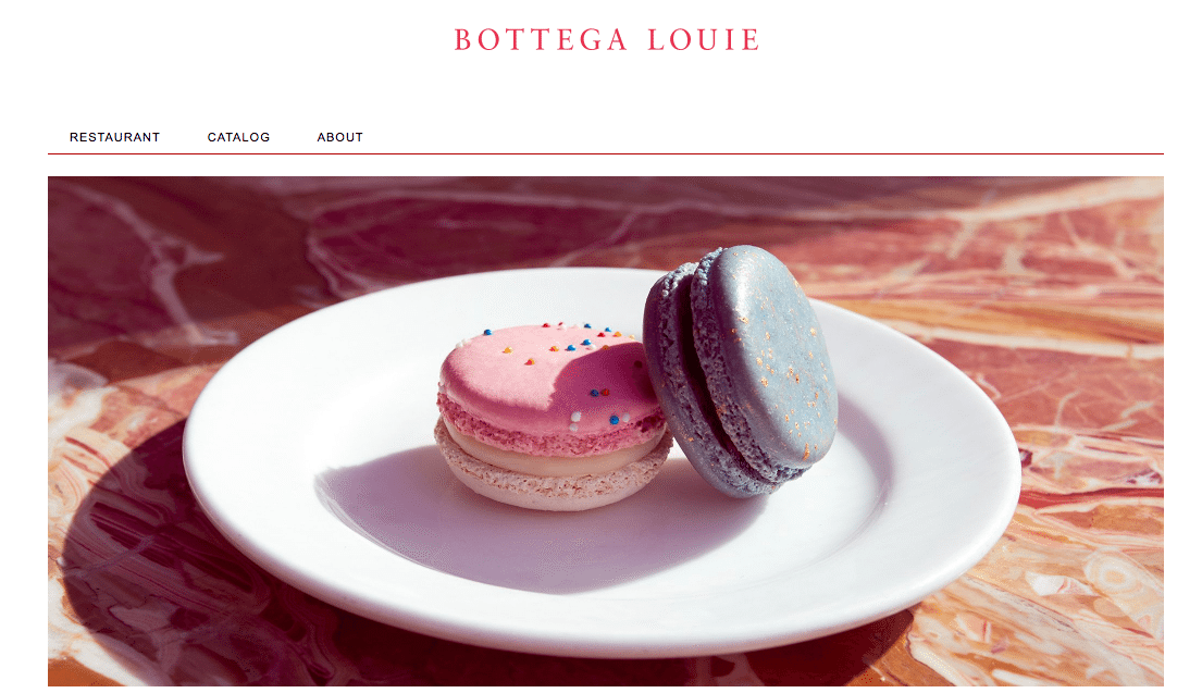
The color palette of Bottega Louie website is very eye-catching. Pastel color and white background give users a sense of calm, relax and obviously increases appetite. The homepage contains a lot of information while it is clearly organized by different color blocks and photos. As scrolling down the page, I feel like walking through a gallery.
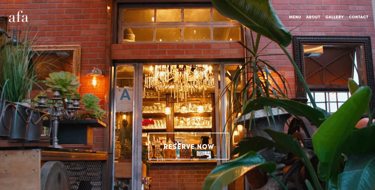
Comparing to the two restaurants listed above, A Food Affair is a different level of dining experience, French, luxurious and unique. The website of A Food Affair has the similar qualities. Instead of having a regular picture gallery on the homepage, a flash screen which plays their cooking process and famous dishes opens customers’ eyes. If a background music is added, the website reminds me of a famous cooking show, the Chief Table series from Netflix. The flash screen ends with a reservation button which gives a purpose not only a fancy design.
-Who are target customers? Customers’ age groups, race and where do they live.
-What are special qualities does this restaurant offer?
-Doing design researches on target customers & potential customers
-Story telling about the brand
-Redesign the Logo
-A US based server or universal for global users.
-Create a modern and fresh color palette
